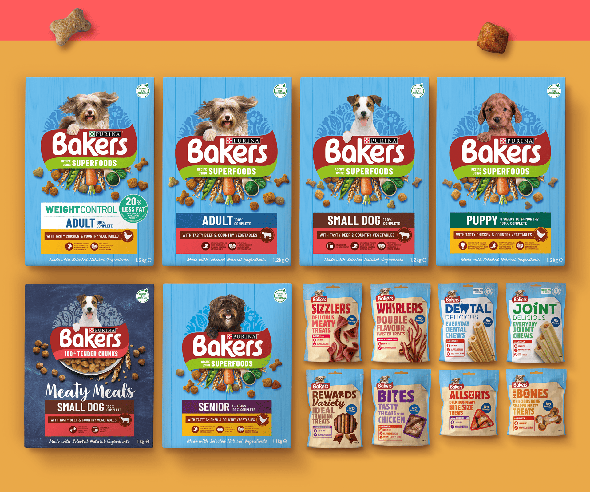
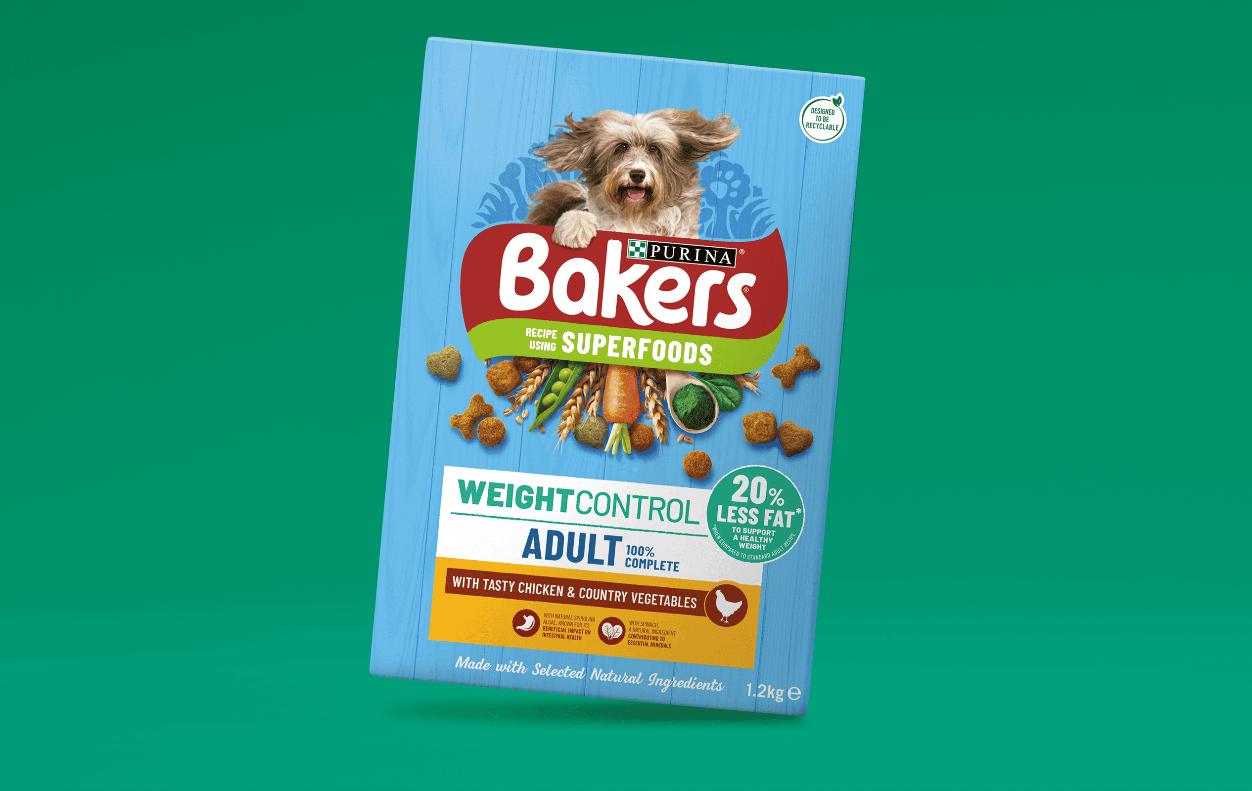
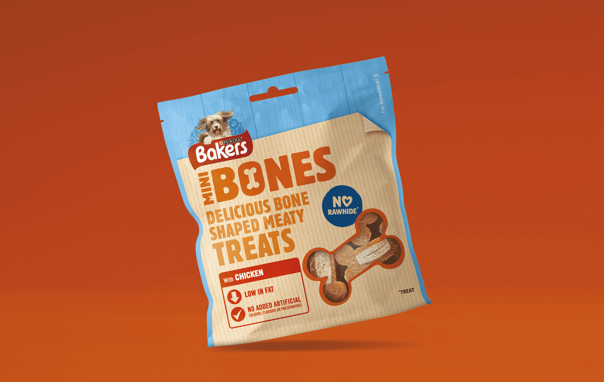
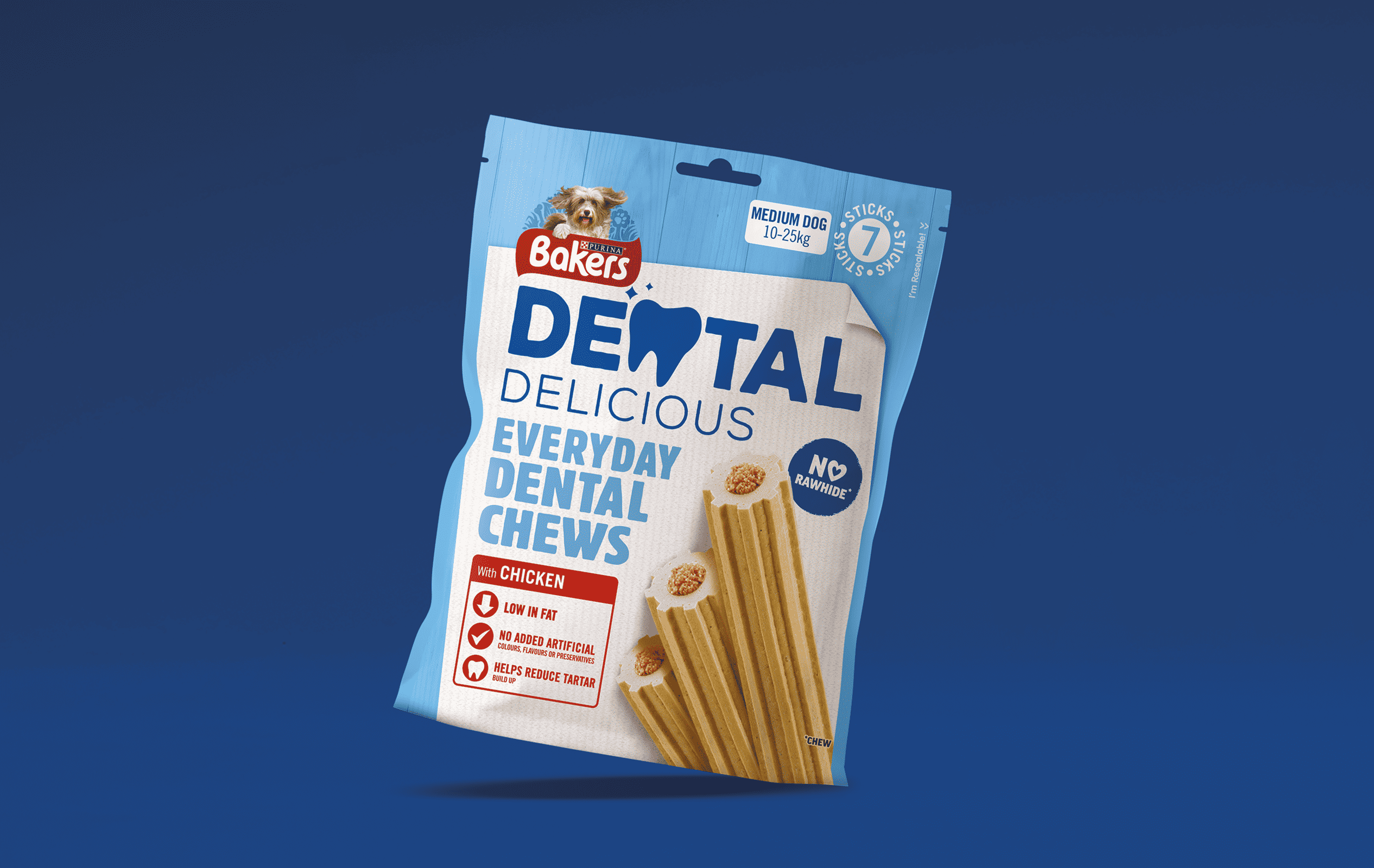
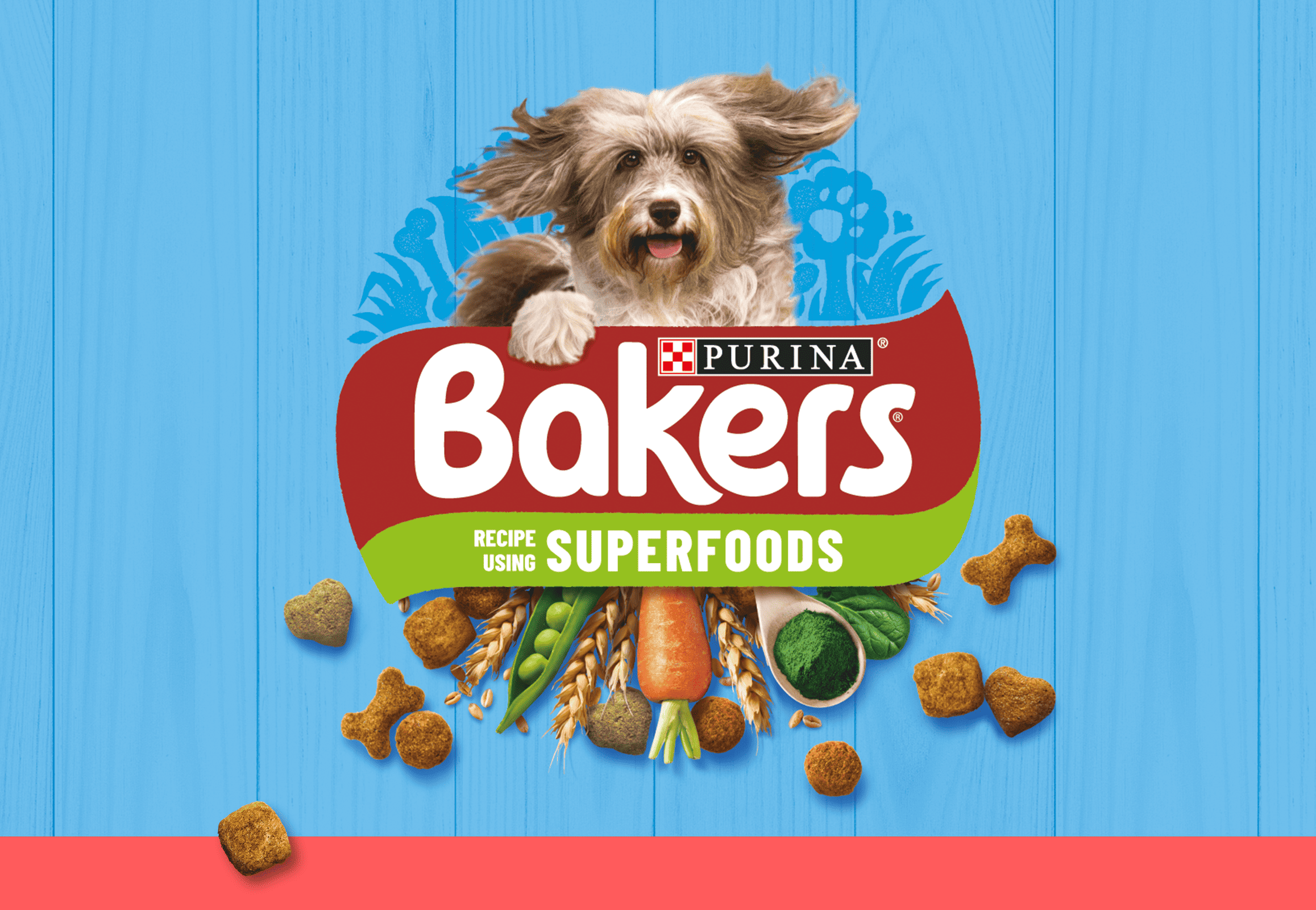
Tasty natural goodness
Something we’ve suspected for a long time is that consumers don’t read words on packs.
The challenge with Bakers was to create a brand that, at a glance, defines tasty, natural goodness without requiring the consumer to read a single word.
We kept the existing assets of blue with a red and white logo but evolved them to look less commercial, less inauthentic, less mass produced and less unbelievable. We got rid of the high shine, the fantasy landscape with a floating logo and recreated the scene with a ‘sky’ of natural textures, earthy tones throughout, ‘real’ food photography and farmers market style typography. This visual representation of ‘natural’ means that at a glance you can gauge the authentic ingredients in a brand you can trust.
A brand you can trust