Jammie Dodgers
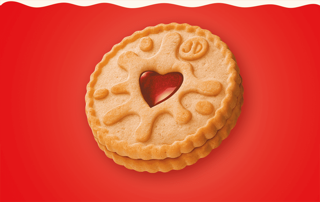
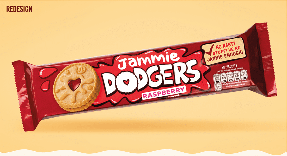
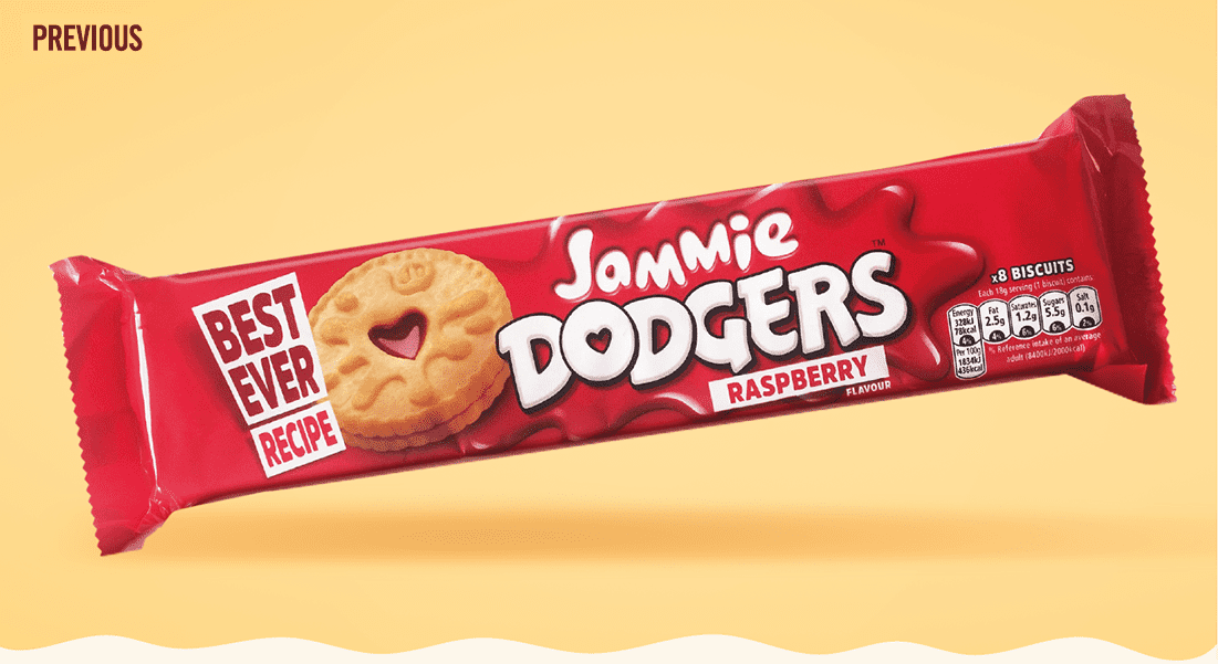
A childhood favourite of the designers here at Ocean, we had a right jammy time working on this legendary brand. Our challenge was to help Jammie Dodgers shake off the false perception that it's full of the the artificial nasties that Mum shouldn’t allow in her trolly. In fact there are no artificial colours, flavours or sweeteners in any dodgers… who knew? Well, we did. And through hand-illustrating the logotype and Jammie-splat holding device we gave Mum natural semiotic cues needed to get Jammie Dodgers back in the cupboard.
jam-packed with real personality
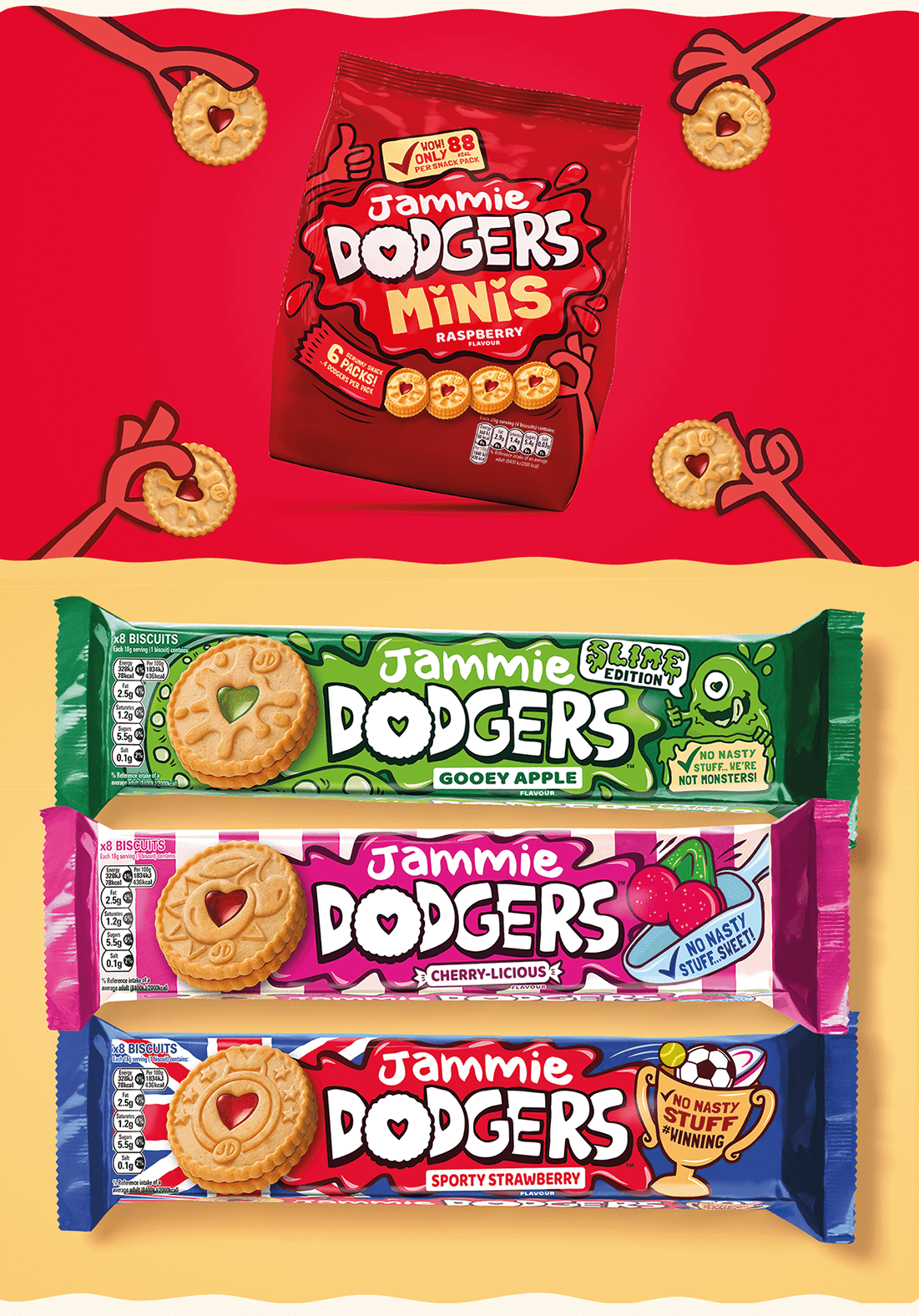
As the Dennis the Menace of biscuits, Jammie Dodgers needed to show off its mischievous playfulness, which had become somewhat overshadowed by the pack's FMCG fakeness. We achieved this through the energy of the hand-drawn splat, the fun illustrations and a playful tone-of-voice throughout. Deliciously sweet jamminess and jam-packed with fun.
The team at Ocean were not only a pleasure to work with, but provided us with just the right blend of the strategic design expertise of a leading design agency, and agility/pragmatism of a tactical nimble partner. Their work on Jammie Dodgers was a critical part of the phenomenal success of our relaunch, making sure a loved iconic British brand of 60 years, remains relevant for
generations to come.
generations to come.