100% NATURAL SPRING WATER
US consumers were unaware that many bottled waters are in fact purified ‘tap’ water - they assumed all water was ‘real’ and therefore of similar quality. Nestlé asked Ocean to premiumize the Poland Spring identity, in order to give consumers a reason to buy it over the competition. That reason was the fact it is 100% Natural Spring Water and nothing else. Additionally, Poland Spring has an enviable heritage, being one of the oldest bottled Natural Spring waters in North America.
THE NATURAL CHOICE
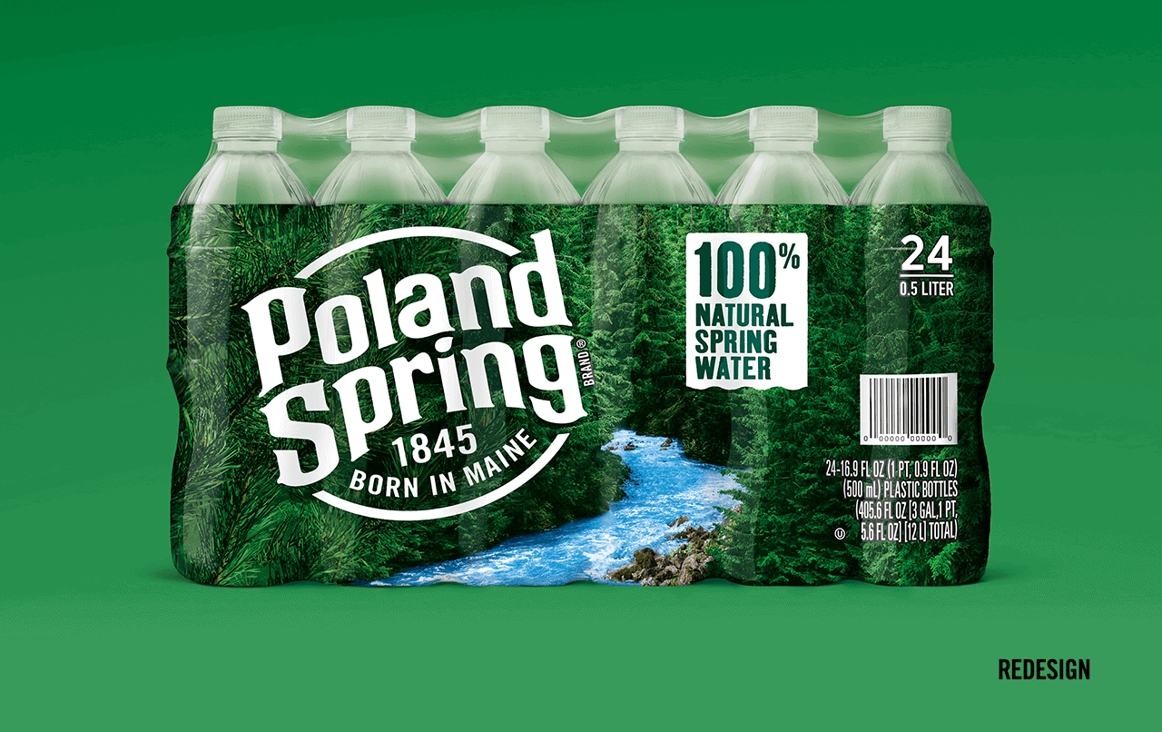
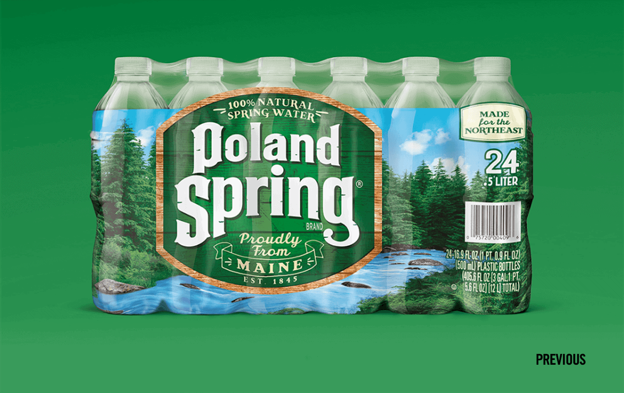
The Poland Spring design had several things going for it, in a category full of modern, blue and white brands - the logo had heritage and the green colour was both distinctive and ownable. However, the execution of these elements on pack was more theme park that national park and the sense of realism required for believability was absent. While the product itself was very real the design was very fake.
We stripped back the logo to its roots, got rid of the fake wooden panelling effect and removed the all-important 100% Natural Spring Water message from the cramped roundel, giving everything space to breathe. The background imagery was entirely recreated to show a more secluded and untouched area of Maine and really maximise the brand colour in the fixture, helping it stand out and stand apart from its rivals.
We stripped back the logo to its roots, got rid of the fake wooden panelling effect and removed the all-important 100% Natural Spring Water message from the cramped roundel, giving everything space to breathe. The background imagery was entirely recreated to show a more secluded and untouched area of Maine and really maximise the brand colour in the fixture, helping it stand out and stand apart from its rivals.
I was impressed with Ocean Branding’s ability to work strategically and creatively as we developed a brand new identity for Poland Spring. The task was to elevate the brand’s positioning in a modern way, highlighting its biggest point of difference while still respecting its brand properties. It was certainly a challenge. Yet Ocean was able to present multiple unique directions that could achieve this in record time, leading to a design absolutely loved by our consumers. That was a big achievement as Poland Spring has a sizeable portfolio, delivering 5 Billion impressions annually through its packaging.