FIT FOR ROYALTY
Over the last 40 years, Badshah (meaning ‘King’ in Urdu) has become one of Pakistan’s favourite rice brands. Grown on the foothills of the Himalayas, and aged to perfection, its aromatic grains are something truly special.
However, when it came to UK supermarket shelves the ‘King of Rice’ was being usurped by its competition.
Badshah needed more than just reputation to succeed at POS – it needed a brand and pack design that communicated its credentials with greater clarity.
However, when it came to UK supermarket shelves the ‘King of Rice’ was being usurped by its competition.
Badshah needed more than just reputation to succeed at POS – it needed a brand and pack design that communicated its credentials with greater clarity.
THE KING RECLAIMS THE CROWN
THE KING
RECLAIMS
THE CROWN
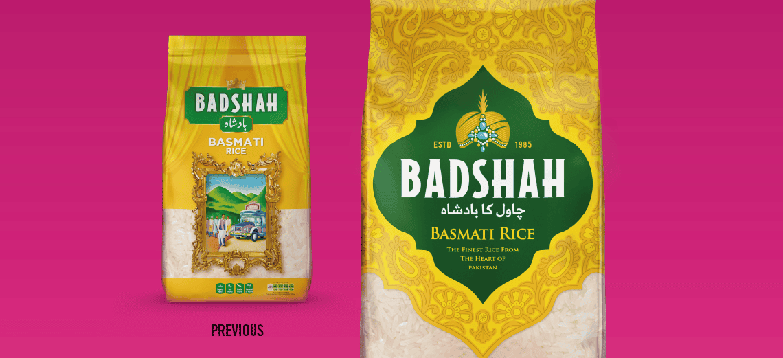
However, the situation wasn’t all bad… The brand had equities worth hanging onto.
The bright yellow background achieved impressive standout, and the pack’s ornate detailing suggested a high quality product. The problem was, there was no cohesive story and a lack of visual hierarchy. Consumers didn’t know where to look – or even understand what they were looking at.
Our solution? We created a simple yet sophisticated holding shape to house all of the pack information. To clarify the brand story, we crowned the logotype with a bejewelled turban – an icon fit for a Pakistani King, surrounded by a rich regal pattern.
And as you can see, the results were royally good…