strong in...
natural chocolatey fun
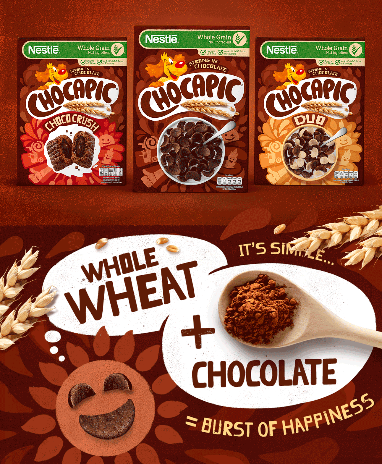
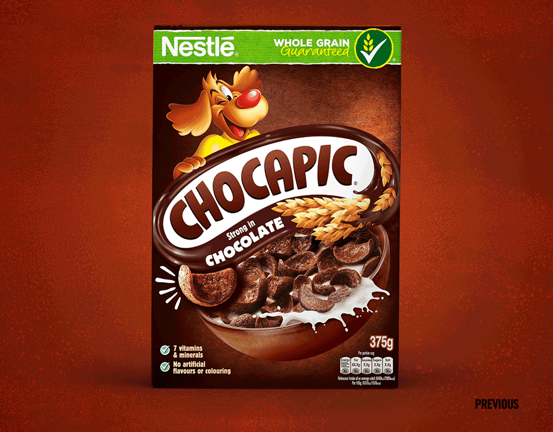
Famously ‘strong in chocolate’ but the Chocapic brand needed strengthening in other areas. As part of our project to update Nestlé’s portfolio of kids cereals, Chocapic was desperately in need of a natural makeover. The taste cues were looking outdated and artificial. The challenge was to focus more on whole grain and inject some much-needed fun into the brand. All whilst keeping things super chocolatey!
PICO’S GOT A NEW LOOK
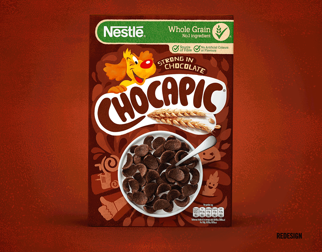
We reinvented Pico and the chocolate world around him with a consistent illustrative style. Then we took simple, realistic photography of the product and the wheat to replace the artificial visuals of the previous design. The result is a breakfast cereal that looks tasty, fun and natural. You'll notice we updated the Nestlé green banner too, tying together all of their cereal brands with this new natural look and feel.