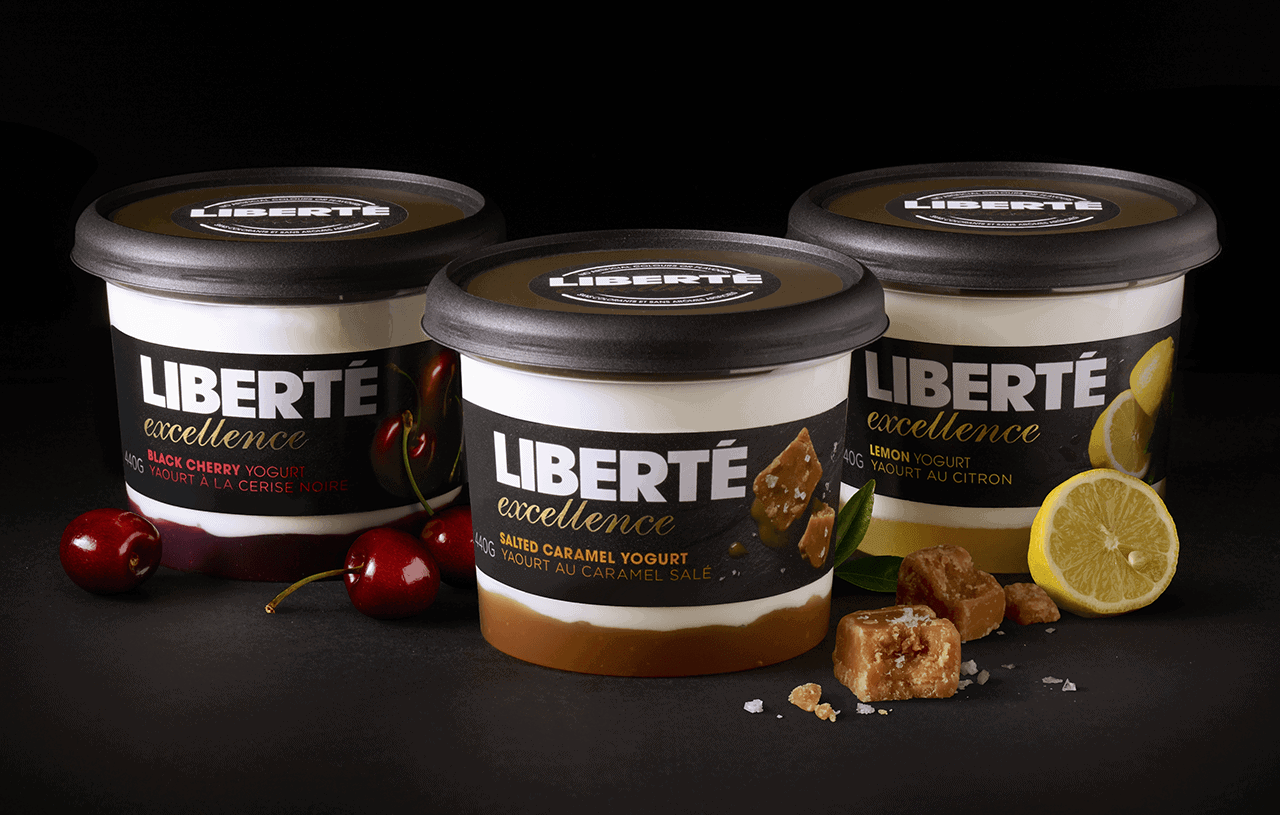
Natural vs Indulgence
When Yoplait approached us to design their new luxurious Liberté range they wanted it to stand apart from their existing offers. It was to be an indulgent treat whilst maintaining the artisanal authenticity that the brand was known for.
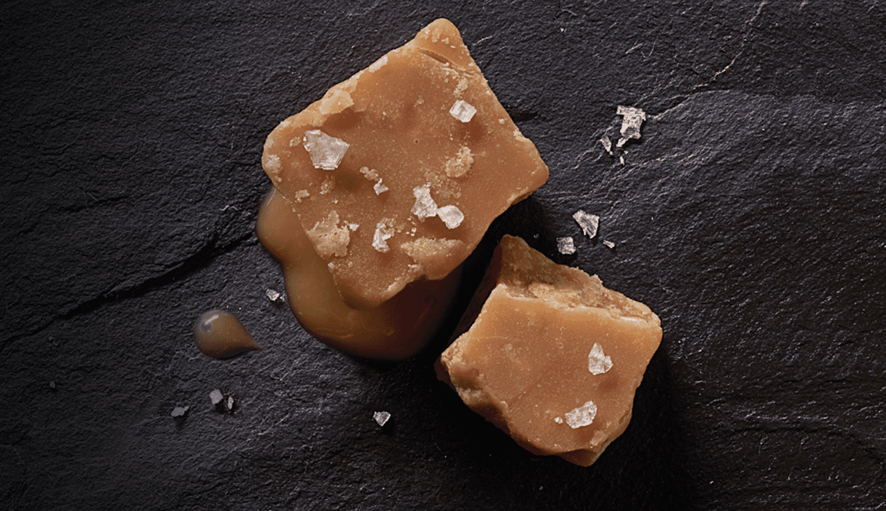
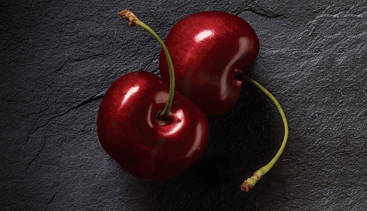
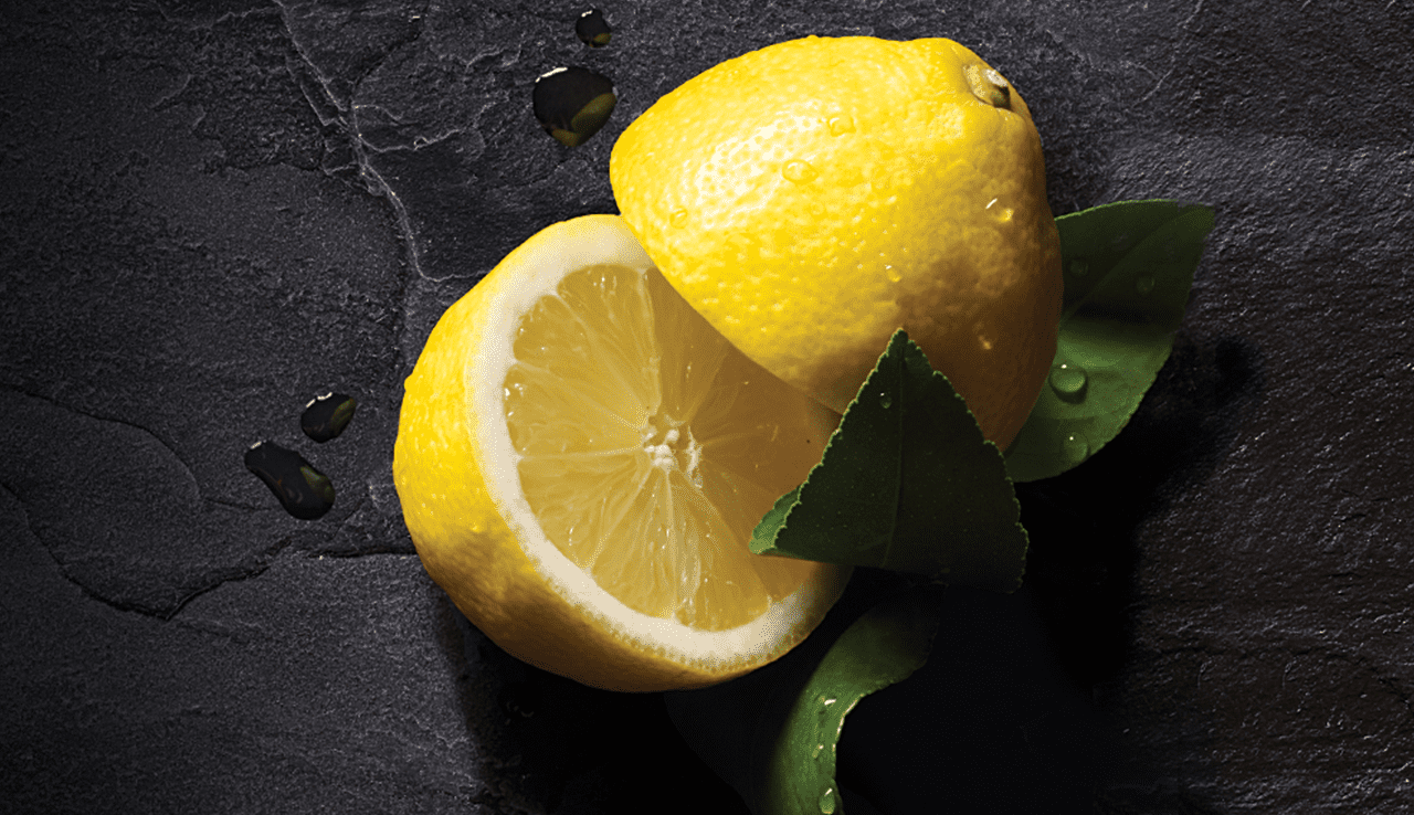
The challenge here was the perceived trade-off between natural and indulgence. Many of the semiotic cues linked to 'naturality' (muted colours, fields & farms, abundant ingredients) are compromised as you move into the category codes for 'indulgence' (rich colours, a focus on sumptuous product shots).
No need to compromise
We kept the distinctive white and black Liberté colour scheme but we flipped it, so the black would not only help to position the range as an indulgent treat but give it real presence in the yogurt fixture. This, combined with the real ingredients shot against an authentic, deli-like slate, resulted in a pot that celebrated its richness whilst still being very real and natural. Natural and indulgent are no longer mutually exclusive.
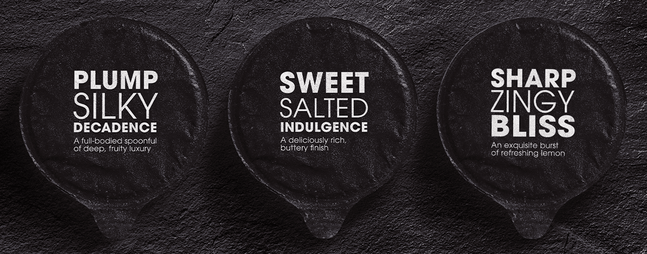
Ocean very effectively created a personality which communicated an indulgent taste and premium feel but at the same time still reflected the natural artisan roots of the brand. A difficult balancing act that was well achieved.