RE-ESTABLISHING
A BRITISH LEGEND
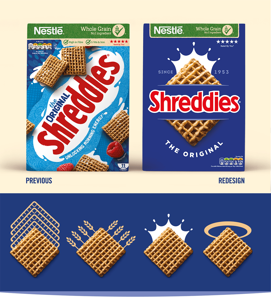
Launched back in 1953, generations of children have grown up with Shreddies as a much loved breakfast favourite. In recent years however private label copy cats which look, taste and even sound the same but at a fraction of the price, have stolen share from the original Shreddies brand. It was time for this British legend to reclaim its rightful and iconic position in the category.
Expertise, heritage, quality and authority
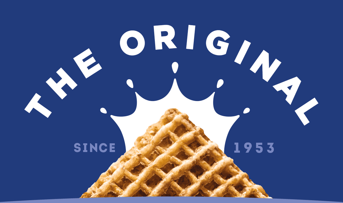
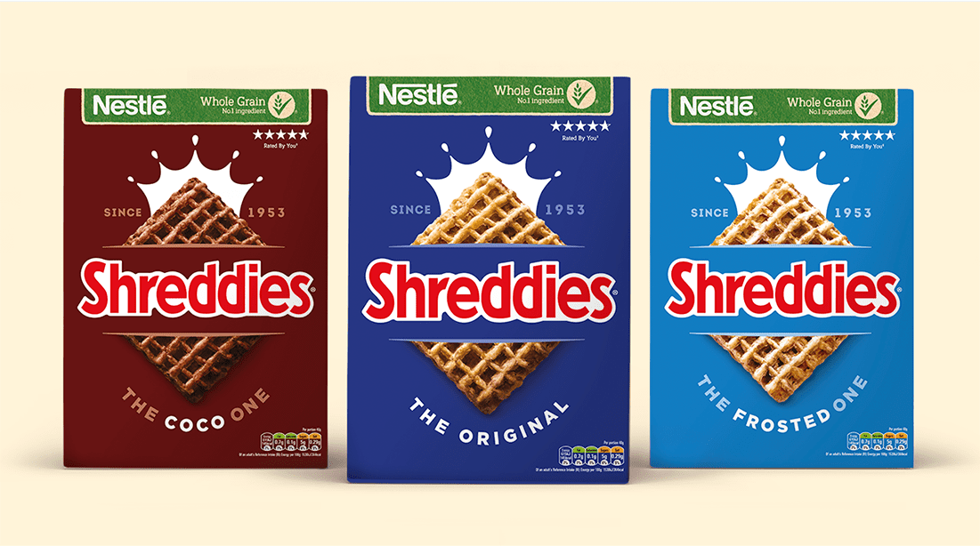
Our solution was to go back to Shreddies’ roots and reflect its status as the one and only Shreddies. No FMCG trickery but turning instead to understated graphics and iconic simplicity. Less is more. The new design was about being bold and confident. Standing out on the shelf from the ‘pretenders’ and catching the eye of lapsed and non-users. Making the private label look cheap, inferior and bland. The original, the best, the one & only Shreddies!
I had the pleasure of working with Ocean on a long-term transformational project for the Shreddies brand. Ocean has been a tremendous addition to our cross-functional team both in terms of strategic input in the initial phase and in terms of excellent designs created for the brand at the end of the process. They are great working partners and I value their opinion and category knowledge.
The advantage of working with Ocean was getting senior members to support throughout the process. The results speak for themselves, we created packaging that is new, timeless and quite literally flew through the research and internal approval process.
The advantage of working with Ocean was getting senior members to support throughout the process. The results speak for themselves, we created packaging that is new, timeless and quite literally flew through the research and internal approval process.