RECLAIMING ITS CROWN...
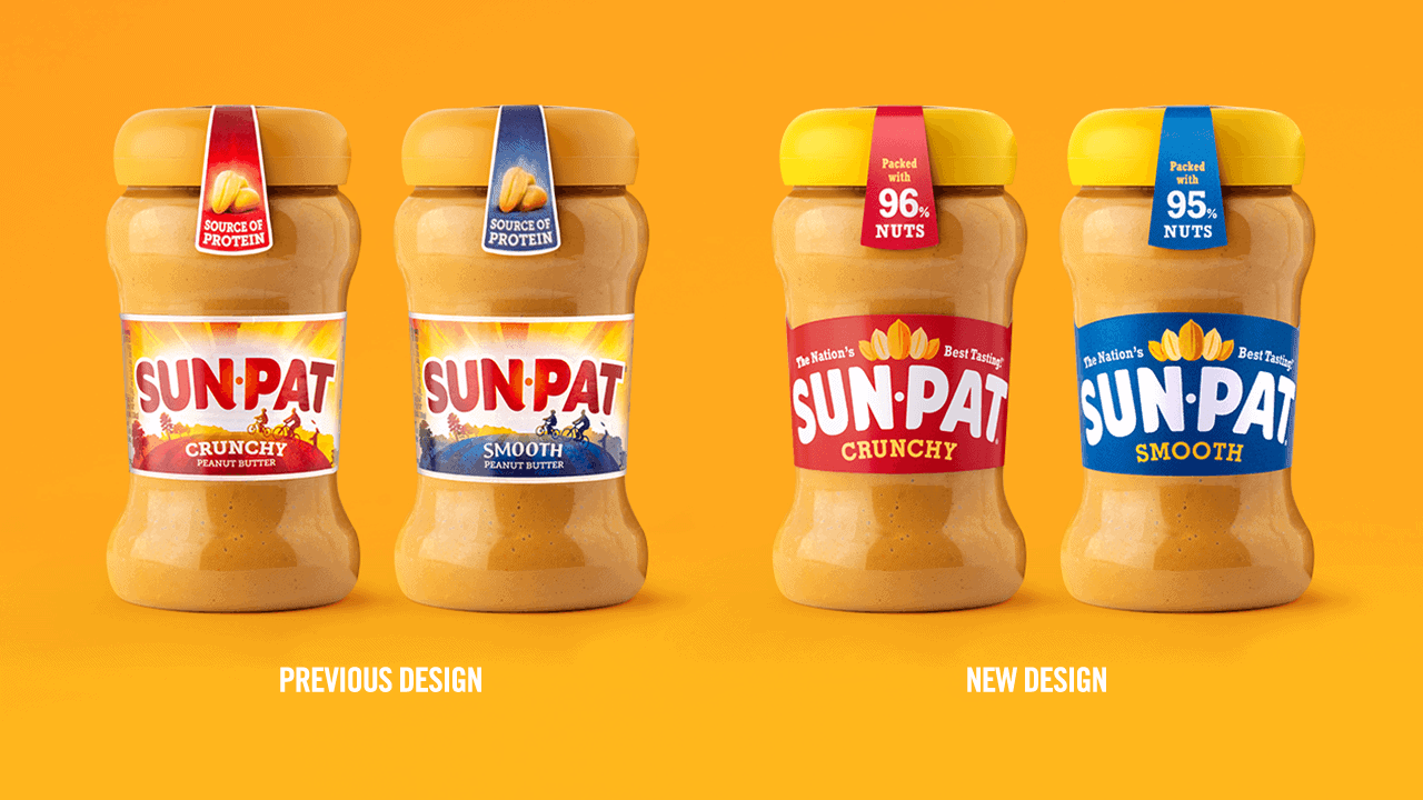
Amongst a sea of trendy nut butters, Sun-Pat had an air of neglect. With its generic FMCG graphics and similarity to cheaper own-label brands, it begged the question "Why pay more for Sun-Pat?"
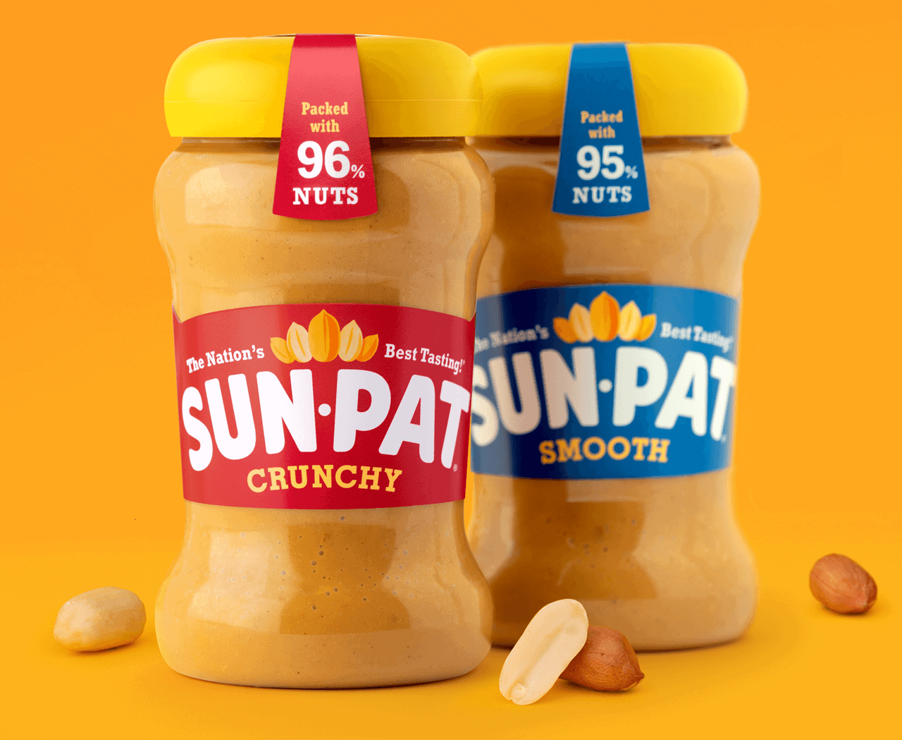
In fact, Sun-Pat is well worth the extra pennies. It’s 96% nuts, palm oil free, and in blind tests it was voted hands-down the tastiest peanut butter on the market. Which we at Ocean can easily believe, as we're Sun-Pat loyalists (crunchy of course).
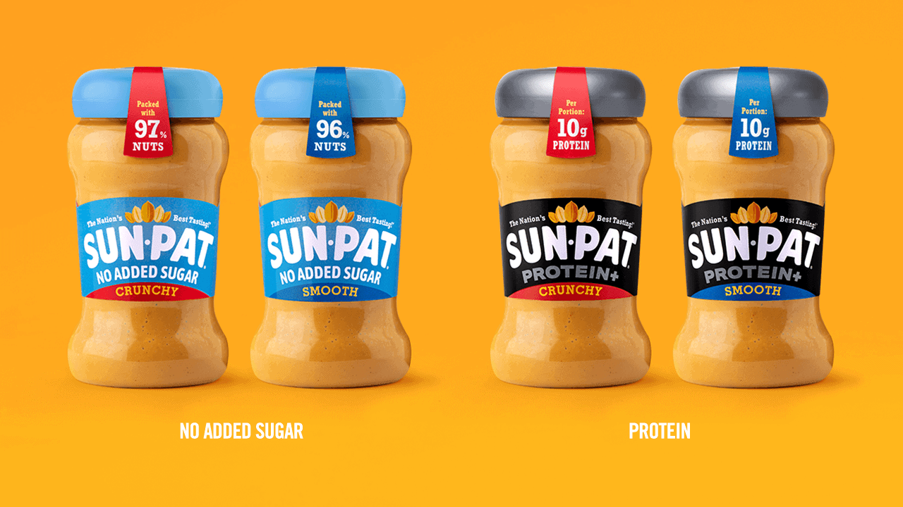
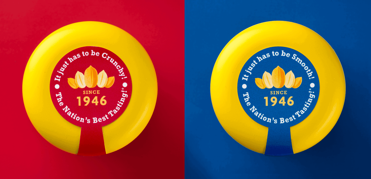
Fuelled by toast and peanut butter, we set about the task of re-crowning Sun-Pat as a British legend. We stripped back the design to hero the iconic and optimistic arced logo in a new curved label shape. We then replaced the fake FMCG photography with hand illustrated nuts in their crown formation; celebrating Sun-Pat as the loveable king of peanut butter.
the
king of
taste
as market leader.